display flex에 대해 정리해봅시다
<style>
.box_wrap{
width: 500px;
height: 500px;
border: 1px solid black
}
.box{
width: 70px;
height: 70px;
background-color: yellow;
border: 1px solid green;
margin: 10px;
}
</style>
</head>
<body>
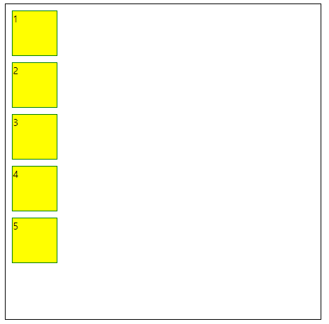
<div class="box_wrap">
<div class="box">1</div>
<div class="box">2</div>
<div class="box">3</div>
<div class="box">4</div>
<div class="box">5</div>
</div>
</body>
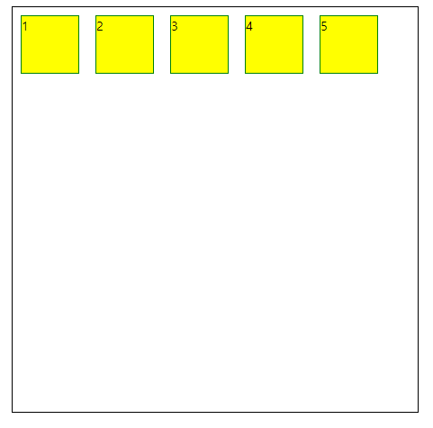
display : flex
부모 클래스에 flex 속성을 줘야 나머지 flex 속성을 사용할 수 있다.
.box_wrap{
  display: flex;
}
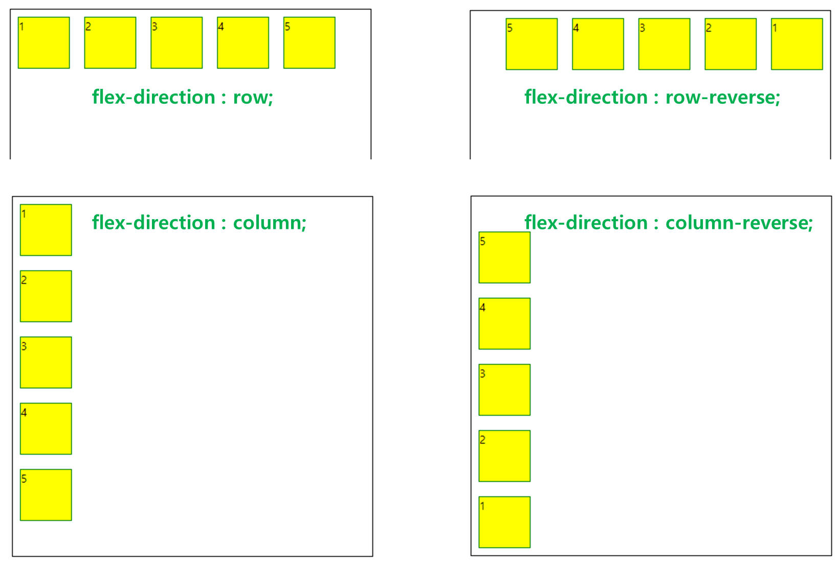
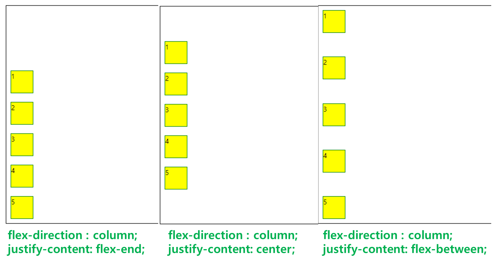
display : flex-direction : 정렬의 방향을 선택
- 정방향 : row;
- 정방향 + 역순정렬 : row-reverse;
- 세로방향 : column;
- 세로방향 + 역순정렬 : column-reverse;
.box_wrap{
    display: flex;
    flex-direction : row;
//    flex-direction : row-reverse;
//    flex-direction : column;
//    flex-direction : column-reverse;
}
justify-content : 수평방향의 여백을 두는 방식
- justify-content: flex-end; (끝점에 맞춰 정렬)
- justify-content: flex-start; (시작점에 맞춰 정렬)
- justify-content: center; (가운데 정렬)
- justify-content: space-between;
(처음과 마지막 자식요소는 양끝으로 배치하고 나머지 자식요소들의 여백을 균등하게 정렬) - justify-content: space-around; (모든 자식요소들의 여백을 균등하게 정렬)
.box_wrap{
  display: flex;
  flex-direction : row;
  justify-content: flex-end;
  // justify-content: flex-start;
  // justify-content: center;
  // justify-content: space-between;
  // justify-content: space-around;
}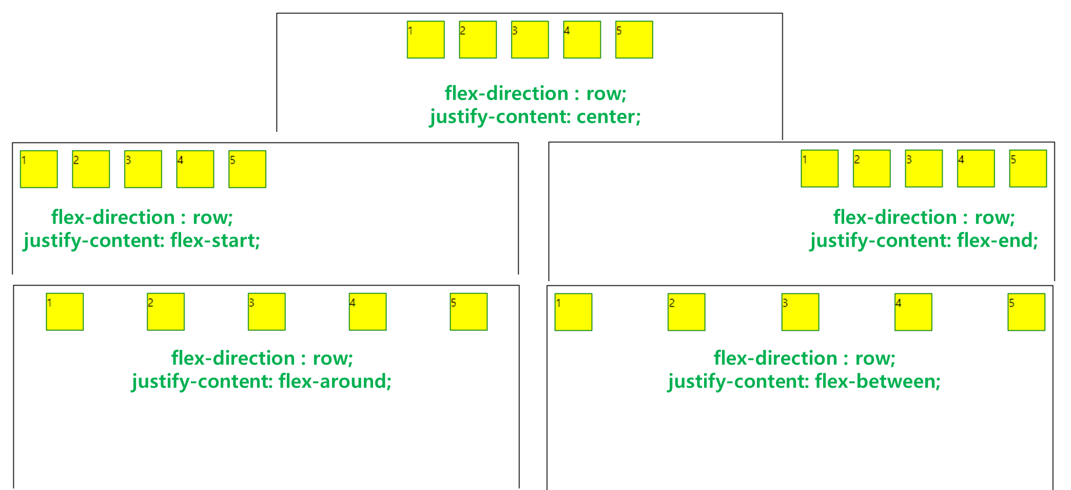
부모 클래스의 direction에 따라 수평방향의 기준이 달라진다.
align-items : 수직방향의 여백을 두는 방식
( = 세로정렬과 비슷하다고 생각하면 된다!, 하지만 이것도 부모의 direction에 따라 기준이 달라진다)
- align-items: center; ( 세로 기준 가운데정렬 , 부모의 direction이 column이었으면 가로기준 가운데 정렬이 된다)
- align-items: flex-end; ( 세로기준 위로 정렬 )
- align-items: flex-start; ( 세로기준 아래로 정렬 )
.box_wrap{
  display: flex;
  flex-direction : row;
  justify-content: flex-end;
  align-items: center;
  // align-items: flex-end;
  // align-items: flex-start;
}
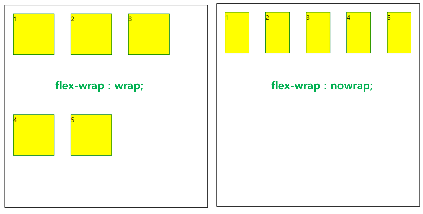
flex-wrap : 부모의 width에 따른 줄바꿈 여부
- flex-wrap : wrap; ( 정해놓은 사이즈(자식요소)를 유지한 채 자동 줄바꿈 된다 )
- flex-wrap : nowrap; ( 배경에 맞게 자신의 사이즈를 조절한다. )
.box_wrap{
  display: flex;
  flex-direction : row;
  flex-wrap : nowrap;
  // flex-wrap : wrap;
}
'개발공부_Blog > HTML-CSS' 카테고리의 다른 글
| API, 다른 앱의 기능이나 데이터를 가져다 쓸 수 있게 해준다. (0) | 2022.11.20 |
|---|---|
| 간단한데 자주 안써서 까먹는 button에 default style없애기 (0) | 2022.10.24 |
| <textarea> value 속성을 사용한다면 (0) | 2022.09.04 |
| JWT / COOKIE / SESSION 차이점 (0) | 2022.01.16 |
| JWT ERROR (0) | 2022.01.16 |


댓글